User Experience Engineering
Saturday, August 05, 2006
Battle of the StartPages: Round 1
I began a comparison of personalized startpages: My Yahoo vs Pageflakes vs Google/ig vs... I wanted to select a given task, and then try the different brands to see how well they serve that purpose. So, I chose job hunting; which personal portal is best for organizing and streamlining a job search? Seems like a project with plenty of room for search, feeds, aggregation, and productivity tools.
Today, I worked with my.yahoo.com and pageflakes.com. Performance would be difficult to quantify, I knew, so I invented the ever-so-casual "ClunkFactor". Clunkiness is here defined as the number of modules/widgets/feeds that could be added to a personalized home page, divided by the number of page loads it took to get there. This reflects the bias that in Web 2.0, page loads are bad, and page updates are good. I cleared browser history for Firefox 1.5.0.6, and began building a job pages.
Site              Modules    Pageloads*
my.yahoo.com      7          46
pageflakes.com    11         29
* In Pageflakes, the pageloads include signup for box.net, uploading a resume, accessing Gmail, and accessing Web pages with Bitty Browser. For My Yahoo, those 46 page loads were chewed up just by searching for feeds and adding them.
My.Yahoo.Com
If you do not let an entire page load, with all feeds, my Yahoo will not allow you to change pages. So, if your default page is News, but you want to change to jobs, you are stuck waiting until each feed loads, for the page menu to respond to input. Workaround: make your default page very sparse. When changing from full pages, grin and bear it.
I loaded the HotJobs module, and noticed several disadvantages.
- To configure, you have to load a separate page
- Only one job search category selectable at a time. Not Internet AND Technology, e.g.
- No keyword input
- No radius or proximity search, only City/State.
- Search box loads new page
Finding those seven feeds with My Yahoo was frustrating. Many feeds that turned up in search results were too general, such as all jobs in Columbus, or too specific, such as HR managers in Dubuque. I could not really add useful job searches without leaving my yahoo, and searching on job sites. I did not come across any functional non-feed modules that would be a handy accompaniment to the feeds. C+.
Pageflakes.com
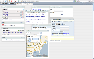
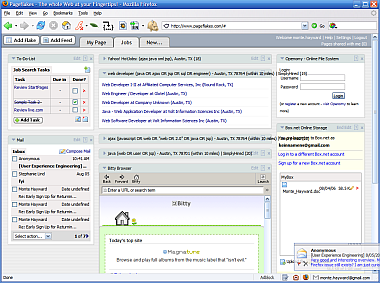
Pageflakes essentially has only one URL, which would help toward the reduced page loads. Tabs are always visible, and clicking them "turns the page" without changing the URL in the browser address bar. Adding a new page is very quick. When adding content to that new page, Pageflakes distinguishes between feeds and modules. This distinction is unclear on Yahoo, to the uninitiated, and quite confusing on live.com.
Modules or "flakes" as they're called here, are located by browsing a gallery of 90 or so items. Pageflakes will need to implement some kind of search, as it's unreasonable to expect users to read all 90 widget descriptions. A scarcely noticeable dropdown menu in the top right does help. It allows you to select tags such as "productivity", "fun" and "communication", to see a subset of the flakes.
Productivity Flakes
At pageflakes.com, productivity includes tools for productivity. This is better than live.com, where "productivity" means "shopping". Here's the Pageflakes productivity lineup:
- Documents
- Writely
- Zoho Writer
- Gmail
- POP Email
- Storage
- Box.net 1GB, registration, login, and read-write can all occur in the flake!
- Openomy 1GB, restricted to retrieval only.
- Organization
- To-Do-List Developed by Pageflakes
- Note
- Address Book - no slurper, no real interaction with email
- iCal Calendar Access
- iRows Calculator
- iRows Spreadsheets
- Note
Difficulties:
- Layout gets confused in Firefox; items overlap and do not stay put. I had to continue the testing in Internet Explorer 6.

- Forms within flakes do not submit when you hit Enter key.
- Long module names do not wrap. E.g. SimplyHired.com search with custom name.
- After each flake "add", browser returns to page where you added. Each flake then renders. Therefore, each flake-add takes longer than the last.
- Gmail module read-only. To read the body of a Gmail, you must open a new window.
- Mail is more functional, and can be configured to POP3 accounts. However, the second account that I added failed to load any message
- No search for feeds or widgets.
- No job posting feeds listed. As with My Yahoo, you must leave the site to gather job feeds.
Niceties:
- preference: Open links in...
- New Browser window
- Pageflakes browser
- This browser window
- Pageflakes browser
Clicking on a feed in your startpage opens the Pageflakes RSS/Web Reader View. It overlaps other modules.

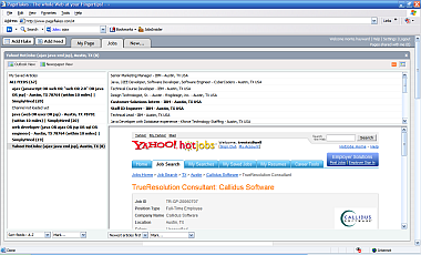
Browse your saved feeds in the left column, view titles in the right column, and read description (rss) or view Web page in the bottom pane. Here, I have aggregated advanced search feeds from Yahoo HotJobs, and simplyhired. An interface like this allows for the rapid digestion of daily feeds or search results. With my.yahoo.com, these feeds would be stuck in their little boxes, and to read any full listings would require a new page-open. In the upper right corner of the Pageflakes feed reader, you can click buttons to toggle between rss description and original Web page, or click the X to collapse the reader. That's more like it.
Round 1 goes to Pageflakes for less clunk and more functionality with fewer page loads. The broken drag-and-drop positioning in Firefox is serious. While the Pageflakes team is fixing that, I might be able to live without Firefox tabs for this one activity. The tabs, and the goodies, are all in the page.
Update: Layout problem in Firefox with Pageflakes appears to be fixed.

I will discuss your other suggestions with our team today.
Thanks
Ole
Thanks for dropping in. Update: I re-checked, and the layout behaves fine in Firefox today. I am able to drag and drop flakes in different columns, and there is no alignment problem. Did you change something?
--Monte
Thursday, August 03, 2006
Windows Live ... (?)
I am testing live.com without an account, at the moment. With its' multi-column drilldown, Windows Live.com borrows a page from the Macintosh OS X Finder. The selection feels a bit empty and puzzling at present. For instance, under "Add Stuff" I browsed the "Productivity" directory, expecting to see todo lists, maybe email, project tracking...
Here are the contents of their columns:
Productivity|*Shopping     | There are currently no items in this feed.
            |Safety Center |
            |              | [add]
Drilling down four levels to find "no items" is disappointing. Also, Shopping would be more consumptive than productive... But, I'm here for the user experience, so I clicked "add". Shopping Beta appeared on the page I had created. So, I got shopping beta by selecting it from a list with no items? Huh?
(I later saw that News feeds typically had items, whereas Shopping does not).
I typed "iPod" into the Shopping Beta form, and clicked the search button. Fast but sparse results appeared, with the listings in wrapping lines, which used the available space efficiently. Live.com calls the wrapping lines format "grid", and has an optional format called "text". "Text" eliminates the pictures and produces rather ugly and repetitive-looking result links. It appears to add price comparison functions.
At the top of the results were controls which I took to be for sorting purposes. Each header or label had a downward chevron symbol.
 category
  brand
brand  price range
  seller
Clicking on these, instead of sorting, produced Ajaxy dropdown menus of the brands, sellers, etc. Selecting one narrowed the search results.
Each result bears a link reading "add to list". Click it, and the browser scrolls to the top of the page, where there is neither list nor item. That's because they are using an href that goes nowhere: http://www.live.com/#, instead of an intra-page link such as #list, or a do-nothing href, such as "javascript:;". Scroll to the bottom, and you discover that the item is added to your list.
There does not appear to be a way to check out. I tried clicking on the link at the top of the module, and was startled to find that a new window opened, and took me to shopping.msn.com. Apparently, I had left my page by performing a Shopping Beta search. The only other controls in the module are "Recent Searches", and links to "Travel essentials", "Tech on sale", and "Summer fashion". Each of these also leads to a new window with an MSN shopping page.
There is a colored divider bar that links "back to my page". This is only necessary because the current module, Shopping Beta search results, has replaced mail, slashdot, and my other widgets on that page. So, unlike Pageflakes.com, google.com/ig, and my.yahoo.com, these do not appear to be functional widgets within pages. They are little more than links to existing Microsoft pages, and a little Ajax to make it possible to find the links and drag them around. Some functions take over "my page", the composition of widgets that I made for a purpose. We do have our reasons for mashing together different content, right? Others open in a new window, representing an even greater disconnect.
It would seem that CNET's Ina Fried got it right when writing "Is Windows Live just another name for MSN?" But that was November 3, 2005, a couple of days after Windows Live was announced. Nine months later, I ask, "is this thing live?"
Archives
March 2006 May 2006 July 2006 August 2006 January 2007 March 2007 April 2007 August 2007 March 2008 April 2008 August 2008 April 2010 May 2010 July 2010 September 2010 April 2011 November 2012 March 2013 December 2013

